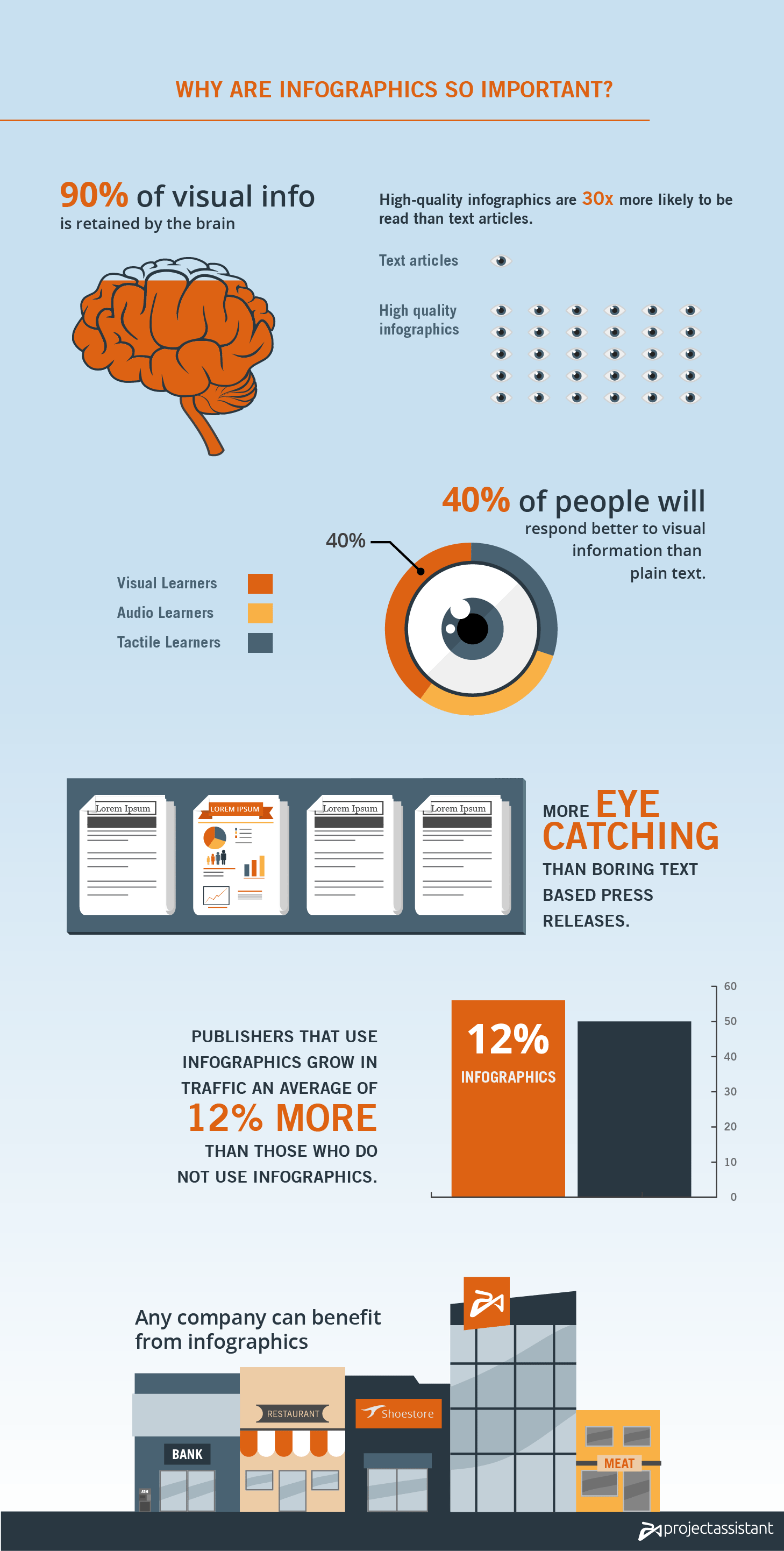
Picture this, you’re in the kitchen trying to make a lean mean lasagna. You pick up a cookbook and open the recipe only to find paragraphs and paragraphs of instructions. There’s nothing but text. What’s the first thing you’d normally do? Unless you’re really into reading, you’d most probably turn the page to look for pictures or diagrams. It’s not being lazy, it’s a natural reaction because humans are visual creatures. It’s exactly why we’ve invented an effective alternative form of communication: Infographics.
What is an infographic?
Information graphics or infographics are visual representations that display data, knowledge and information briefly and clearly with the use of both images and text.
Infographics are not a new concept. You may have more recently encountered long scrolling images on the web with diagrams and charts, but infographics have been present since 30,000 BC in cave paintings depicting activities, hunting animals and events in an area. As graphical presentations of data, they’re definitely infographics.
What composes an infographic?
Pie charts show percentages or proportional data of 6 or fewer categories while bar graphs compare different variables in rectangles starting off from a single level. Line charts are similar to bar graphs but are usually used to show data in time series. Pictorial charts use relative sizes or repetitions of the same icon or different icons with values usually near the icon, this kind of chart is used for comparisons too.
Infographics are not always plain graphic representations. They utilize images and text to compliment each other. Think of it as a hybrid of text and image.

Where are infographics used?
Recruitment
Companies can use infographics to recruit potential employees. They are useful in showcasing services and qualifications required for a current job vacancy. A good designer can create an infographic that evokes a sense of excitement and urgency in a job seeker, in effect speeding up the recruitment process.
Narrowing down complex concepts
Infographics don’t explain with long sentences, they show the direct point. It is much easier for someone to see a difference than read or hear about it. Especially when talking about percentages or statistics, a visual representation is easier to understand.
Comparisons
Infographics in comparisons explain or show the differences or the similarities of two or more objects. Take for example infographics for before and after results, speed and performance or even just comparing the difference between dogs and cats.
Showing Survey Data
It may be difficult to comprehend survey data in one go when it’s jampacked with digits and data. The sight of tables filled with numbers might automatically make us skip through because it looks complicated. Infographics allow for easier and more visual display of data that may have otherwise been ignored. For example, music notes represent quantities of listeners or instruments represent genres of songs to visualize the result of a music survey.
Interesting Facts
There are millions of interesting facts about our world are only appreciated when put into perspective. Take for example the depth of the ocean. It’s quite difficult to imagine because we’ve never seen it but once put into the perspective of its equivalent height in terms of high rise building, it becomes easier for a reader to picture out.
Raising awareness
Infographics have been used to evoke strong feelings of concern and action towards pressing issues that affect us all. Whether it’s the status of endangered animals, an outbreak of a virus, effects of global warming or smoking, sending a visual message can resonate much further.
When words aren’t enough to explain
What they say is true, “pictures paint a thousand words”. That being said, an image can project meaning into our brains a whole lot faster than just plain text. Let me ask you, what gets to you faster?


You see, human beings are wired for visual engagement. It takes 15 symbols to say caution wet floor, while just one depicting a man slipping can mean the same thing.
Infographics and the Interwebs
In social media, Infographics can spread like wildfire considering the topic is really interesting. And since 2007, infographics has increased to 9900%. No matter how you turn it around, we are more adept in dealing first hand with the visual aspect more than anything else. Well unless you’re blind, that is.

